
| Hapiel | Posted: 26 Dec 2024, 12:44 AM |
|---|---|
 Member Posts: 5 Joined: 30-October 21 |
Hi all, I stumbled upon the HR code concept: https://mitxela.com/projects/hr_code This is something I've been thinking about myself as well, and reading upon mit's thoughts is inspiring. The post concludes with that there may not be enough "timing" info. To get the ball rolling for any possible improvements on this concept (before even trying to code a working version and doing some actual tests), one could for example invert some of the character cells. Here I inverted all odd numbered ascii codes. A QR style mask could be applied to make the pattern less chunky, but that would make the pattern less human decodable. As I was doing this, I realised that this did make it a bit harder to distinguish the url from the checksum when reading it, so I added a subtle line. 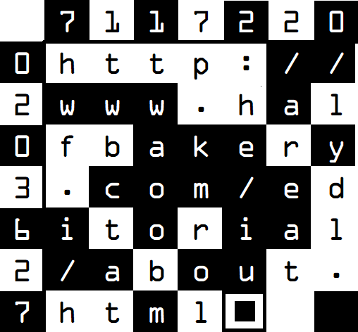 Another question goes to, what would be the most OCR suitable font? Someone on StackOverflow recommends Inconsolata https://stackoverflow.com/questions/316068/what-is-the-ideal-font-for-ocr And there is also OCR-A and OCR-B https://en.wikipedia.org/wiki/OCR-A https://en.wikipedia.org/wiki/OCR-B But that made me wonder, considering the similar looking characters below (in Inconsolata), maybe the most ideal encoding is not ascii, rather we should perhaps first consider if the modulus 10 of the similar looking ascii is actually different. One could even go as far checking if odd or even are different on 2 similar looking characters. 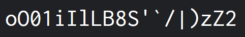 With all these checksum obscuring layers, I do wonder, how important is it that a user of such code can manually check if the checksum is correct? Probably hardly at all. In this case, why not also bump the checksum from ascii sum modulus 10 to modulus 16, to make false positives less likely. Hexadecimal should be easy enough to decipher by OCR, right? So far my ramblings. Maybe one day someone (including me) will do something with these thoughts, just like Mitxela's thoughts led me to these. Happy holidays ------------- |
| [top] | |
| Hapiel | Posted: 26 Dec 2024, 01:01 AM |
|
Member Posts: 5 Joined: 30-October 21 |
Did a tiny bit more googling, found 2 more projects: http://valentinheun.com/portfolio/hrqr/ Fun idea, even includes a reader (which I wasn't able to test), but difficult for humans to read. https://github.com/hantuzun/hr-code Proof of concept, nothing much interesting but it did spark a neat amount of comments on news.ycombinator: https://news.ycombinator.com/item?id=21418882 Both of them named it HR... haha ------------- |
| [top] | |
| Hapiel | Posted: 26 Dec 2024, 01:38 AM |
|
Member Posts: 5 Joined: 30-October 21 |
 Ok now I'll stop dumping my brainfarts in this thread. ------------- |
| [top] | |
| mit | Posted: 27 Dec 2024, 12:51 PM |
 yeah whatever Admin Posts: 687 Joined: 4-May 16 |
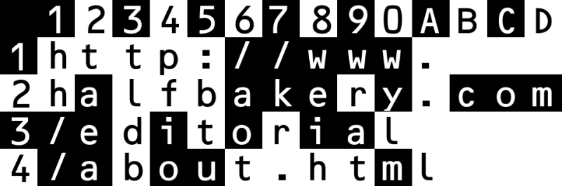
Hello, interesting to think about this again. It feels like the logical next step would be have a grid of text with coloured squares instead of just black/white. Could be RGBCMY which would probably let you encode the full message. You'd want some guarantee by protocol that the human-readable message couldn't be different to what's encoded. Ideally the areas would complement each other, so the lower-left corner's encoded data would correspond to the upper-right text, minimising the effect of damage or unreadable areas. But I don't think HR codes would ever take off. The only next step is when OCR becomes good enough. Perhaps we can help it on its way. Hyperlinks are often drawn with a dotted underline simply as a visual aid that it's a clickable link. What if we standardised those dotted underlines to provide useful timing information for OCR? We'd probably still want a fiducial of some description just to make it clear that it's not a regular dotted line. Hmm...  ------------- |
| [top] | |
| Hapiel | Posted: 27 Dec 2024, 01:31 PM |
|
Member Posts: 5 Joined: 30-October 21 |
If you're encoding the full message and having the text on top, the more redundant the text becomes the easier it becomes to 'hack' the qr, and swap out a character to take you to a different url than the user expected. Why colored codes? They're probably much harder to print and therefor use. And since the resolution already needs to be high enough to be able to read characters, there is probably a lot of space to encode extra information in b/w binary, if we don't stick to the character grid resolution. I do fully agree with your last point, and had already thought a bit about this myself too. I like your mockup! I know too little about OCR to know what the bottlenecks are. Would enforcing a specific font allow algorithms to read it faster? Would adding some kind of 'timing' feature allow to read it faster, or at least read it better when the medium is not presented perfectly straight? I really like the use of the square icon to remind people of scanning with their phones. I wondered if the dotted line could be a dot dash line to encode a checksum... aaand now it's a barcode again! ------------- |
| [top] | |
Sign in to post a reply.