
Recursive Notes Part 2
2 Apr 2023Progress: Demo
The initial experiments of recursive part 1 were successful.
Maybe a year after I published the prototype, I got a message from someone who was willing to pay me to add in some of the missing features. I always love these types of requests – there's nothing quite like getting paid to do something you wanted to do anyway.
It didn't take long to patch their improvements in, but it turned out this was the push I needed to do a whole load more work on the software anyway. Since the last update, here's what's been implemented:
- User interface improvements. It's now right-click to jump into a note, double click to edit, and adding a new note or drawing is controlled by the toolbar.
- Pen smoothing. Lines drawn are now bezier-smoothed between points.
- Drawing tools improved, you can now draw Arrows, Rectangles and Lines, or deselect the drawing tool to avoid accidentally making marks.
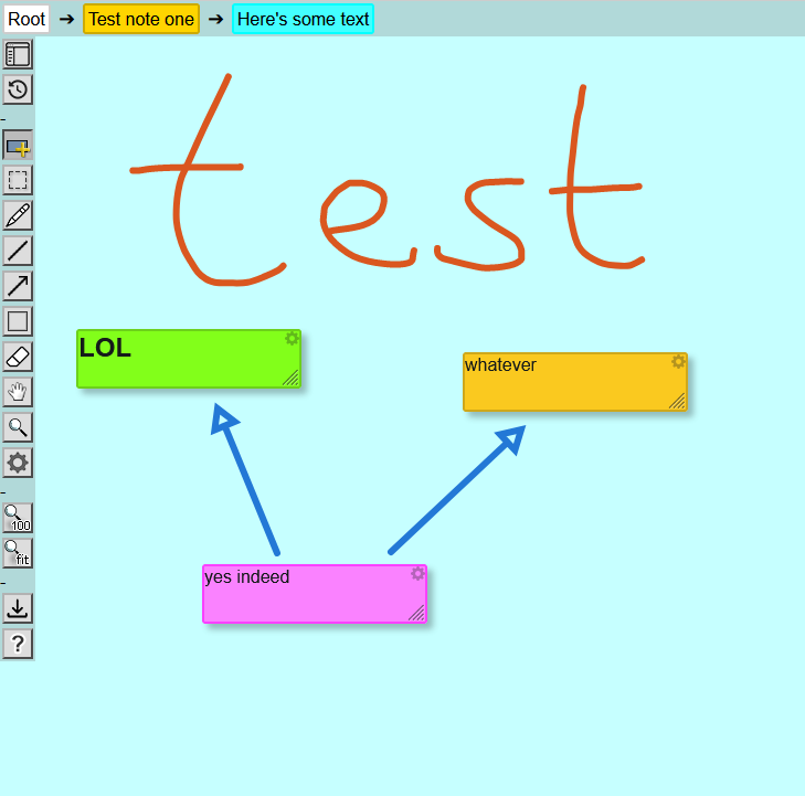
The icons were intended as placeholders, I did them very quickly, but as often happens I'm now used to them and reluctant to update them
- Visual improvements to the notes, the subnotes are now accurate miniatures, with real text on them, slightly blurred.
- Markdown improvements, including nested lists. Really I should have pulled in an existing markdown library, but I ended up just repeatedly enhancing the placeholder I originally made. Also supports images and links. In an extremely hacky fashion, you can even paste in images, which are translated to base64 strings. When I eventually write a server, this'll be replaced with an upload script.
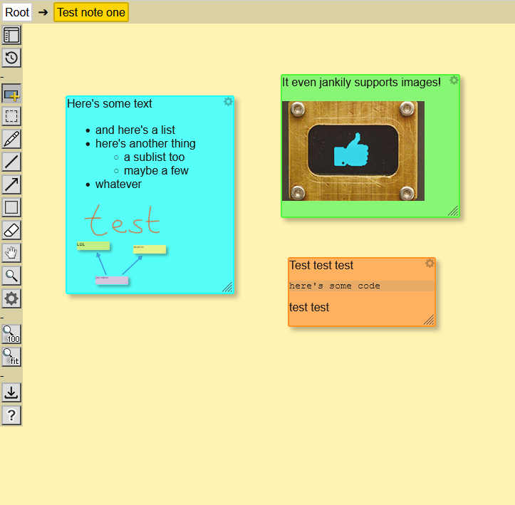
A pleasing feature is that if you double-click the bullet point of a list, it will strikethrough that item.
- Fixed downloading large JSON files, the old way was more limited.
- Infinite pan/zoom on notes. This makes a big difference, and means looking at it on a small screen or phone is a lot more usable. Also added touch screen support, with multitouch pan/zoom. Buttons to "zoom fit" and "zoom 100%" were needed, the temptation to just zoom out endlessly is difficult to resist.
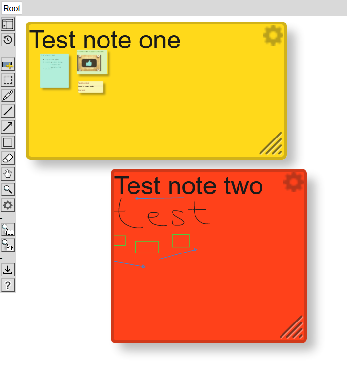
- The ability to "pin" notes was added.
- Note IDs. The original prototype was deliberately written without needing a unique ID per note, but looking forwards this is something absolutely required. One of the main benefits is that we can assign a hashstring in the URL with the note ID, so individual notes can be hyperlinked to, and the back/forwards history is patched to work as expected. This is a huge quality-of-life improvement, I should have done it to begin with.
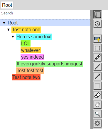
- Outline tree in a sidebar. I was crying out for this from the beginning but knew it would be tricky to do. Well, nothing quite beats slamming your head against the keyboard for a few hours, and all of a sudden an outline appeared. Within the outline, all of the links are to show those notes, and any note can be dragged onto another to change its parent. You can even drag from and to the trail at the top. The outline tree was implemented as a series of nested HTML5 details / summary tags. This is nice from a semantic point of view, but it is quite limiting in how much you can style it.
- A search feature was added, which covers all of the text in all of the notes. Typing highlights matches, hitting enter cycles through results (and shift-enter cycles backwards). Regex is supported but not required. It's hard to say what the correct behaviour is when it finds a result, should it jump into that result, or show its parent? At the moment I settled with jumping into the result if it has child notes, or jumping to its parent if it doesn't.
- Keyboard shortcuts greatly enhanced, in addition to hotkeys for tools you can navigate with the keyboard too (arrow keys, page-up/page-down/home/end). I also added a help file as one of the tool buttons, which shows the keyboard shortcuts, markdown reference, and so on.
- A marquee tool and group actions. You can draw a box around things, or Ctrl+A to select all. You can then move all of them, change all their colours, strikethrough all of them, or move all of them into another note. The select box follows a defacto standard for CAD, where drawing the box left-to-right only selects notes wholly enclosed, and drawing right-to-left selects all notes even partially included.
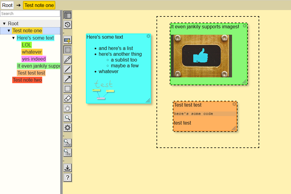
I wanted the dotted outlines to be animated, this isn't impossible through CSS but it's such a hack to make it work that I decided it wasn't worth it. You have to do an animated tiled gradient background, and it's pretty much impossible to get it to loop smoothly.
- Pointlessly stuck a miniature visual of the current note in the favicon.
- The biggest update of all, I added strict separation between the interface and the database. This meant re-writing huge chunks of the code, probably more than half of it. All changes are now done via a consolidated interface in the code, consisting of an action that has a definite inverse (undo). It may not be obvious why I wanted to do this, the only visible benefit is the undo/redo history is now infinite. Previously it was saving a complete copy of the document for each undo state, but now it's a series of actions. It also means that hitting undo or redo will apply the change without needing to reload the document. Given that even my biggest documents are only a few hundred kB it's impossible to gauge how much of a difference this makes, but I'm certain it was worth it.
The real reason for this rewrite is that it's an intermediate step towards a fully online, collaborative document. When I come to write the server, which will happen eventually, having all the changes as a series of events that can be piped between machines is essential.
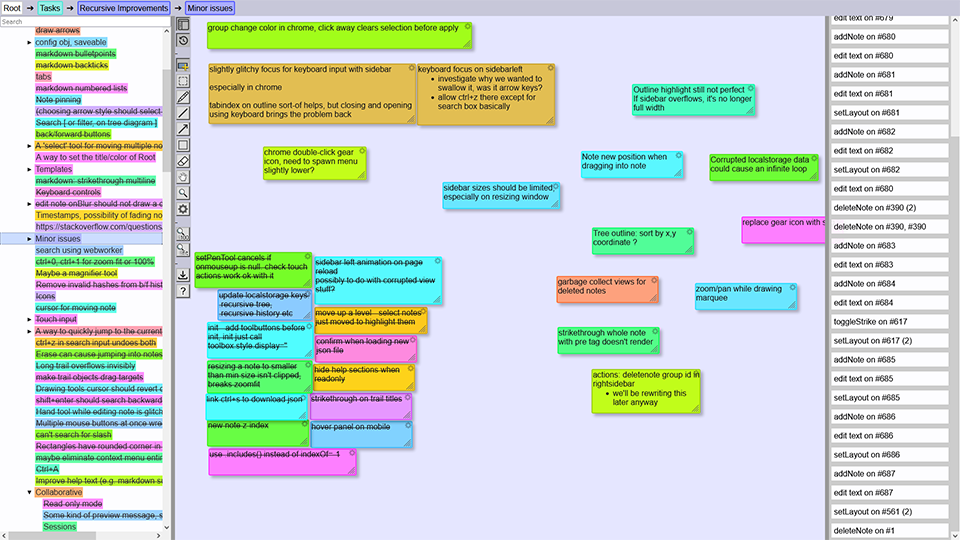
- Added a very basic sidebar on the right that shows the undo/redo history. In the future this'll be replaced with something more full featured.
I had, half-heartedly, been using the recursive notes program to manage various projects, but it wasn't until I added the tree outline with search feature that this properly became viable. There was a very clear change between forcing myself to use it for the novelty, and suddenly finding that the notes program was no longer in the way of my thinking. Naturally, the thing I've been using it most for is to manage improvements to the recursive notes program. But also, I've been using it to manage other projects and for the most part, it works! One of the most notable things is that I often run into glitches or minor inconveniences, which usually leads me to either patch it right away, or at the very least, make a recursive note about it.
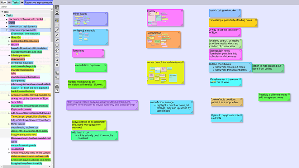
With the browser's onstorage event, and the rewritten database interface, it's now possible to synchronise the document between tabs. The undo history interleaves in a way that's potentially glitchy but on the whole mostly usable. This is a good proxy for what comes next, of course.
In my use case, it would be sufficient to just add a "save" button that uploads it to a server, a force-push if you will, that overwrites everything. I'm a single user and it would cover all my needs. But that's not what I want to do next. Naturally the next thing to implement is full collaborative editing with automatic merge conflict resolution. I'm feeling confident! How hard could it be?
You can try out the current version of recursive at the new URL here. Note, I can't guarantee that it's stable, so don't depend on it for anything life-critical. You can save the document locally and continue to run it from local disk, although you may also need to download the icon images too.
Other ideas and planned features
Aside from collaborative editing, here's some things the notes could do with.
- Proper activity log. The right sidebar is mostly a placeholder at the moment, but ultimately it could be the full history of the document.
- Templates. I'm still not sure how best to go about this, whether notes should have different types, or if the addNote tool should just create a note with a fixed content, or if simply duplicating a note is enough. If we did add note types, that could open up a lot of options (and a lot of headaches). Perhaps a spreadsheet type? Another desirable would be a calendar type. Again, not really sure how best to interleave this with the recursive concepts. A fixed calendar would be easy to dump into a note, but really it should have a bit more than that. Maybe an endlessly scrollable timeline.
- Expiring notes. If we add a date-modified and date-created to each note, we could do things like making it change colour as it gets out of date. Easy enough from a programming perspective but making the interface simple and intuitive is the tricky bit. The idea of post-it notes that fade away over time is quite appealing.
- Better drawing tools. What's there so far is fine but if you actually try and use it to take notes and diagrams it quickly becomes frustrating. We need all the normal vector tools, and we need to be able to modify lines easily. Another thing I'm crying out for is to simply add text, without needing to add another note. You can add a note and make it transparent, but that's clunky.
- Possibly showing the entirety of a note's text on it when you're in that note. Currently it just shows the title and the child notes. I'm not sure how I feel about this, I've kind of gotten used to the system as it is, but when I take a step back it feels like maybe the text should be visible and editable on the background of a note you're in.