
Plotting
5 Jun 2020Progress: Complete
This page is about my adventures with plotter art and the algorithms I've developed for vectorizing pictures.
To play with the algorithms, head here >> plotterfun <<
For the source code and a quick overview head to the github page.
Video
Story
All of my plotting took place on the LIYU SC-631AM Vinyl Cutter at the London Hackspace.
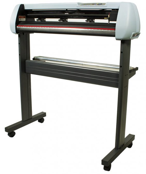
I played down the rant in the video, but in reality there were many more reasons I was afraid to touch the vinyl cutter for so long. The cutter is very nearly a printer, and printers I hate more than anything. Not quite the same as my irrational phobia of front-end frameworks – fear and loathing are different things!
Printers are so awful in so many ways, they represent everything I hate about consumer technology. DRM, ink that costs more than champagne, razor-and-blades business model, drivers and printer jams and printer queues that block forever, you couldn't ask for an all-round worse experience. Couple that with my many valid complaints about cheap Chinese CNC machines and their impossible proprietary systems and it's easy to see how the vinyl cutter, sitting bang in the middle of the venn diagram, could be the worst of both worlds.
But it isn't. It just works. It's just a serial port that listens for HPGL, a language similar to (but simpler than) G-Code. The ink is as cheap as regular ballpoint pens. There's a freaking pause button on the machine, and if anything plays up you can just pause it, fiddle with things, and resume the plot. I couldn't design a better plotting experience if I tried.
Squiggles
Squiggles are where I started, and the initial edits were all about trying to prevent blobs of ink accumulating on one side of the pen. SquiggleCam draws each line in the same direction, so my theory was to alternate directions, both to plot faster and to even things out. It didn't quite have the effect I wanted. Later I decided to try spirals, since then the pen must be moving in all directions fairly evenly. But as you can see, blobs of ink still built up and smeared onto the image every so often.
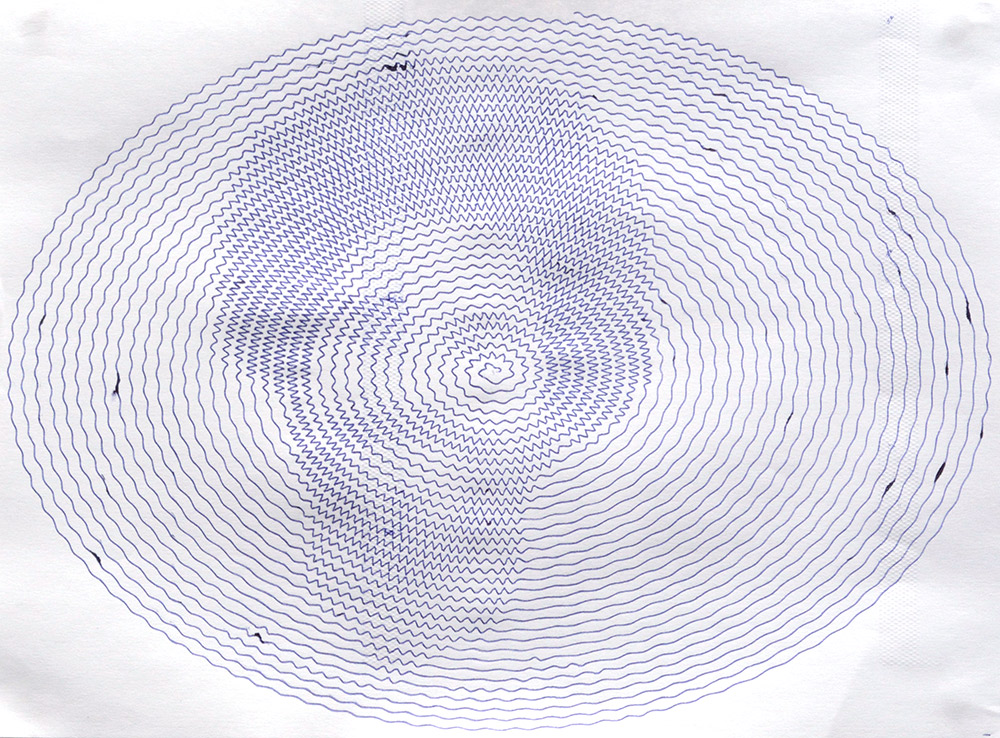
The oval shape was a quick fix for the fact that SquiggleCam had the wrong aspect ratio for my puny 4:3 webcam. Stretching the spiral in inkscape brought the image back to normal.
You can also see in the image above a couple of embossed textured stripes, which were caused by the presser-feet holding the paper in place. They're a lot like the mechanism in a sewing machine. In some plots, the rollers picked up the still-wet ink and rolled it over the image. There's a bit of an art to positioning these feet where they'll hold the paper steady but not affect the image.
One way to avoid ballpoint pen problems is to not use a ballpoint pen at all. It was easy to mount a felt-tip marker into the plotter, once I'd found some poundland pens of the right size.
Polygon spirals were the inevitable next step. With a dense spiral, the image is very clear, but I find it more interesting to reduce the density, making the squiggles as messy as possible, so the difference between an up-close inspection and viewing the image from afar is more extreme.
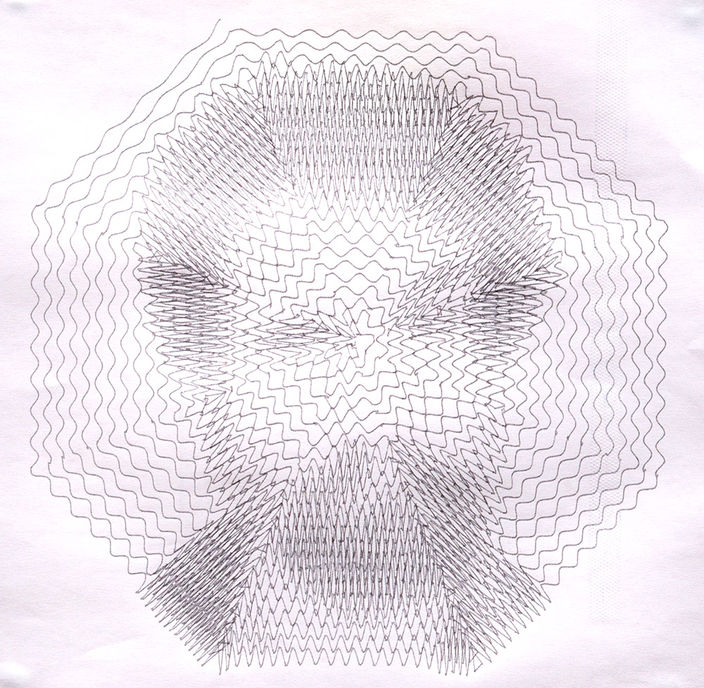
Octagonal! It's also nice to position the centre of the spiral right between the eyebrows, for maximum hilarity.
Stipples
I feel a bit guilty for having stolen the whole concept of StippleGen, so I want to be clear about giving credit to Evil Mad Scientist Laboratories for originally implementing it, and they credit Adrian Secord for coming up with the algorithm.
StippleGen was quite fun to re-implement. One of the critical steps is the polygon integration, working out the new centre of mass for the polygon. To do this we need to sum the value and positions of all the pixels within the polygon, and divide by the total. StippleGen scans over the bounding box and makes repeated calls to point_in_polygon(). My approach was to walk around the perimeter of the polygon, pushing a list of coordinates into a stack. We then scan between the extremes of these coordinates. My code is a fair bit longer, but it runs a lot faster.
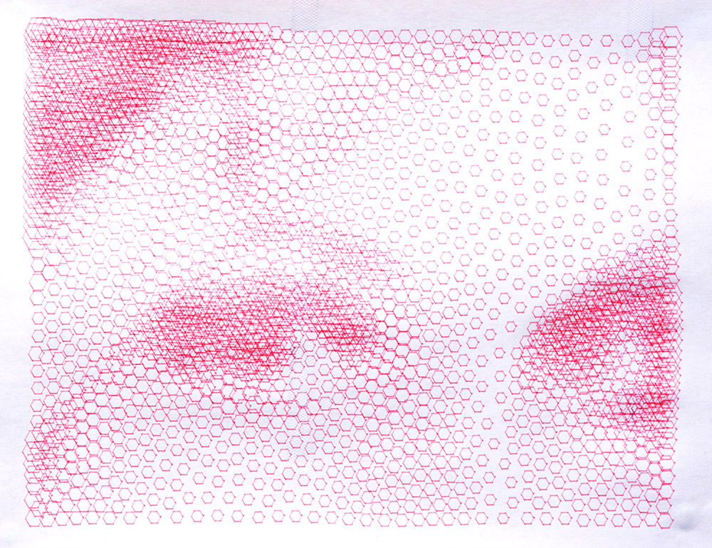
In addition to running faster, you don't have to download anything to use it, and it doesn't freeze while it's running*. Another benefit is that it's easy to customize the stipple shape, spirals (for filled circles), snowflakes, pentagrams and hexagons are just a click away.
(*SVG path rendering still happens in the main thread, so insanely complex plots like 100,000 stipples can still cause it to choke. I may add a 'hide preview' option so it can iterate faster on these.)
If you don't have the luxury of viewing these pictures from a distance, zooming in and out of the page is a pretty good substitute.
It's hard to find images where TSP art works well, but the monochrome outline of the hackspace logo certainly fits. All one line!
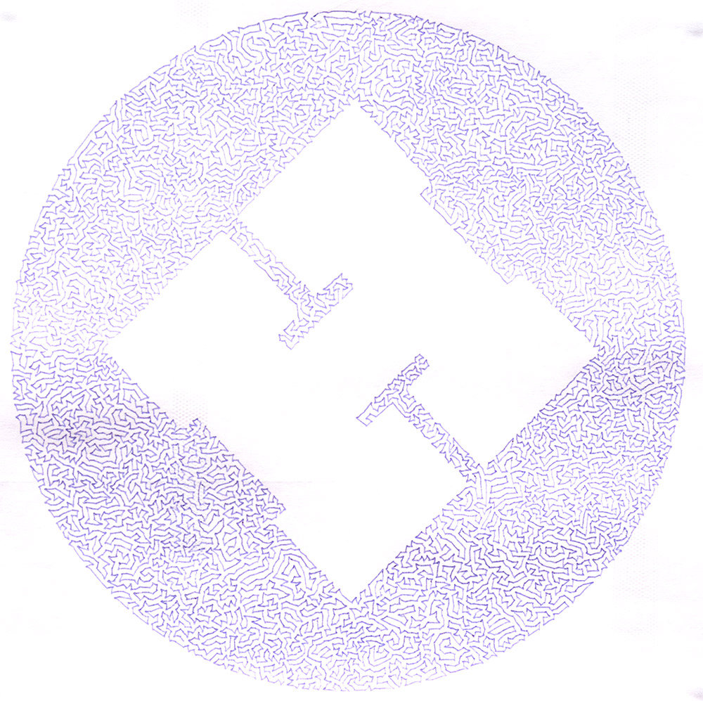
The large open area with protrusions is a bit of a problem for the 2-opt TSP algorithm. Depending on the random arrangement of the initial stipples, quite often the path will end up with a crossing from one protrusion to the other. The algorithm isn't bold enough to reroute the path all the way around the perimeter, so the crossing never disappears. However, since the whole program runs so quickly, it's easy enough to just run the algorithm a few times until it randomly ends up with a good arrangement.
Linedraw
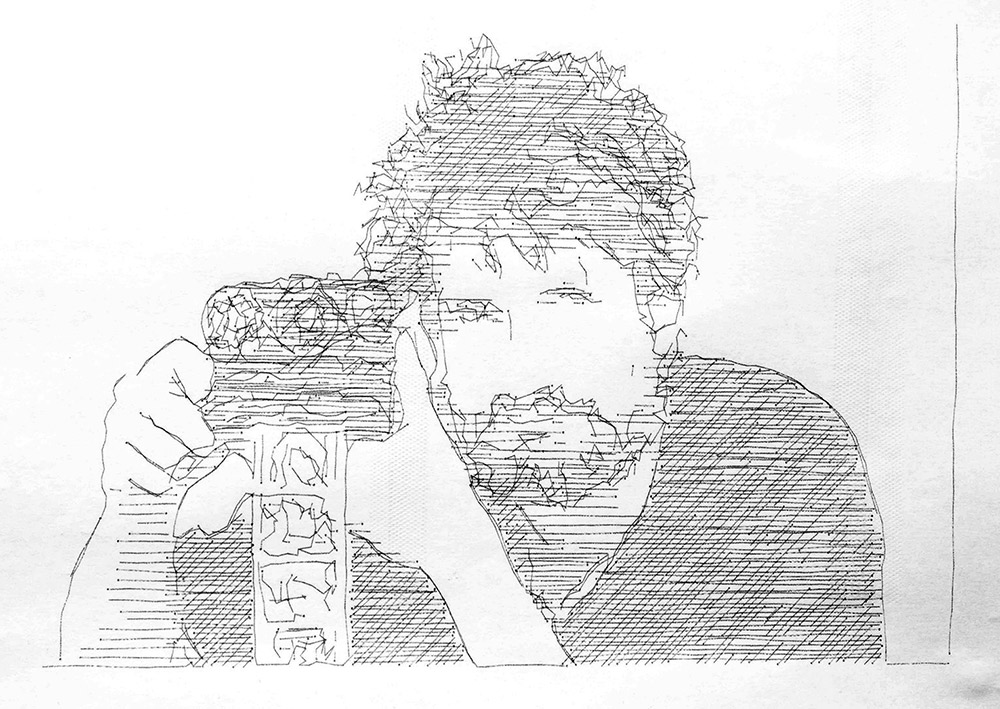
Linedraw by LingDong- is a great program and the only reason I re-implemented it was that invoking it from the command line doesn't have the same amount of fun as pointing a webcam at someone and clicking a button. I also just had my regular curiosity about what it was doing. The line tracing is simpler than I expected, just differentiate (Sobel filter), threshold and then vectorize the lines by following adjacent pixels. No line-thinning is needed, although there is a kind of parallax error since the traced lines are never quite on top of the originals. This disappears as soon as you squirt the Perlin noise on everything.
More algorithms
Not sure what inspired Subline, but there's definitely an album cover out there somewhere with a similar design. In this plot the paper started to slip towards the end, but hey, that just adds to the art.
Plotterfun was a software project, but there was still some metalwork involved – spontaneous metalwork, the best kind of metalwork.
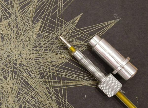
A custom collet was quickly churned out to fit a gel pen that another hackspace member brought in. The design changed repeatedly mid-way as it didn't just have to fit the gel pen, but also the particular collection of non-broken thread taps in the vicinity. Naturally I couldn't resist knurling the knob.
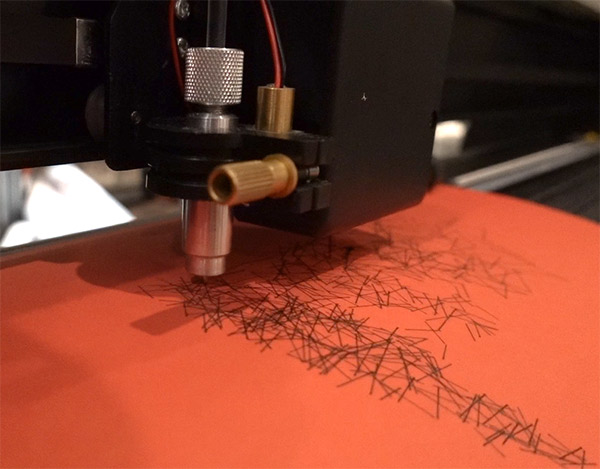
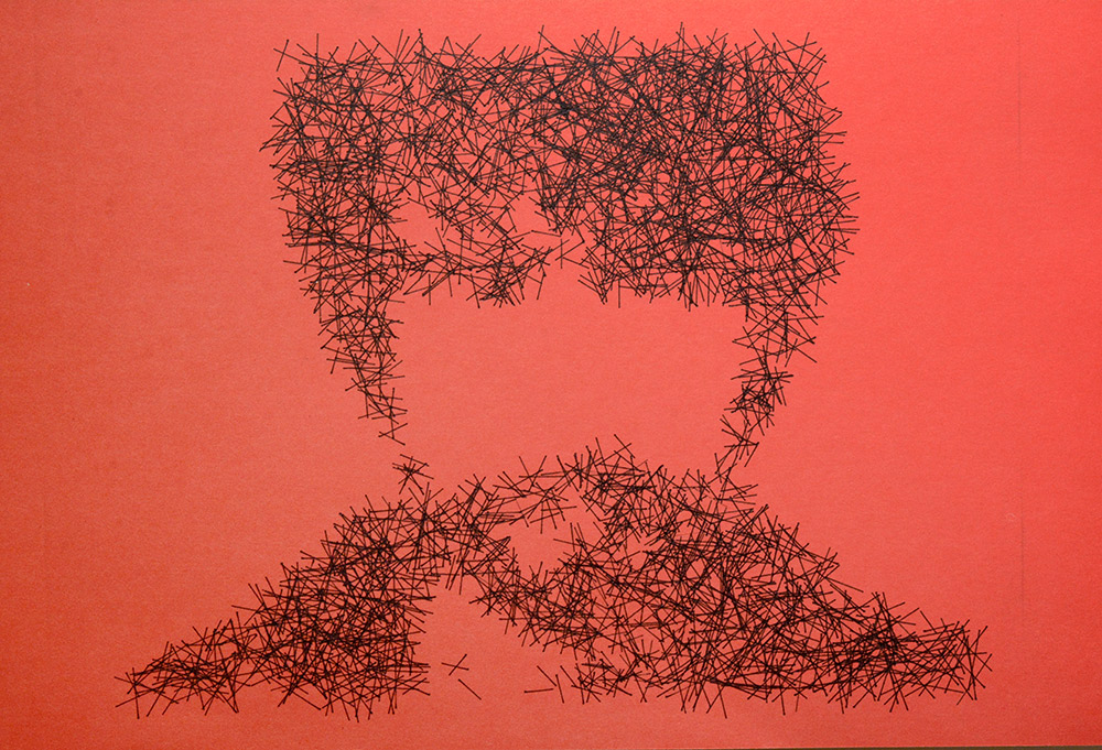
I found the black gel pens particularly useful for drawing on coloured paper, they have a much higher contrast than regular black ballpoints. This is the "needles" algorithm, one of the simplest, and the one most likely to enhance sideburns.
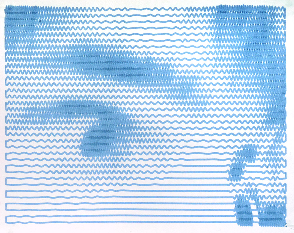
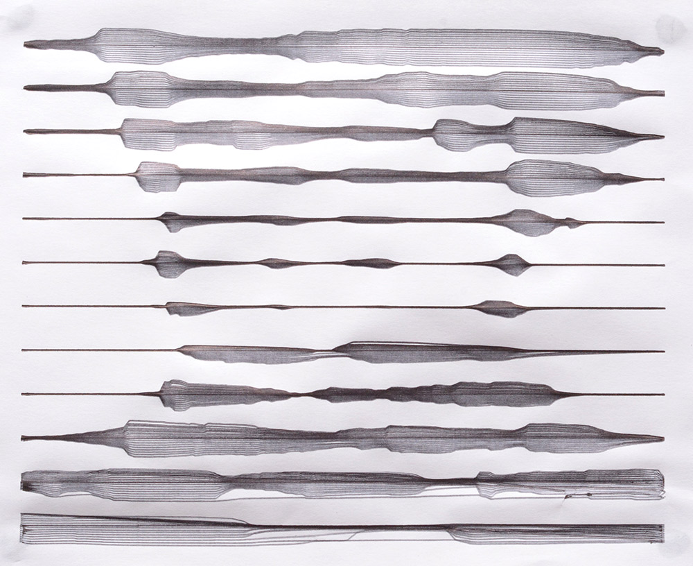
Another gel pen plot and another algorithm, "Waves" was meant to look like the contour lines of a map. The progressive errors as it gets further from the centre cause a different kind of effect, and the resulting image can be hard to comprehend. If you can't see the picture, here's a hint: it follows the same theme as most of my other plots.
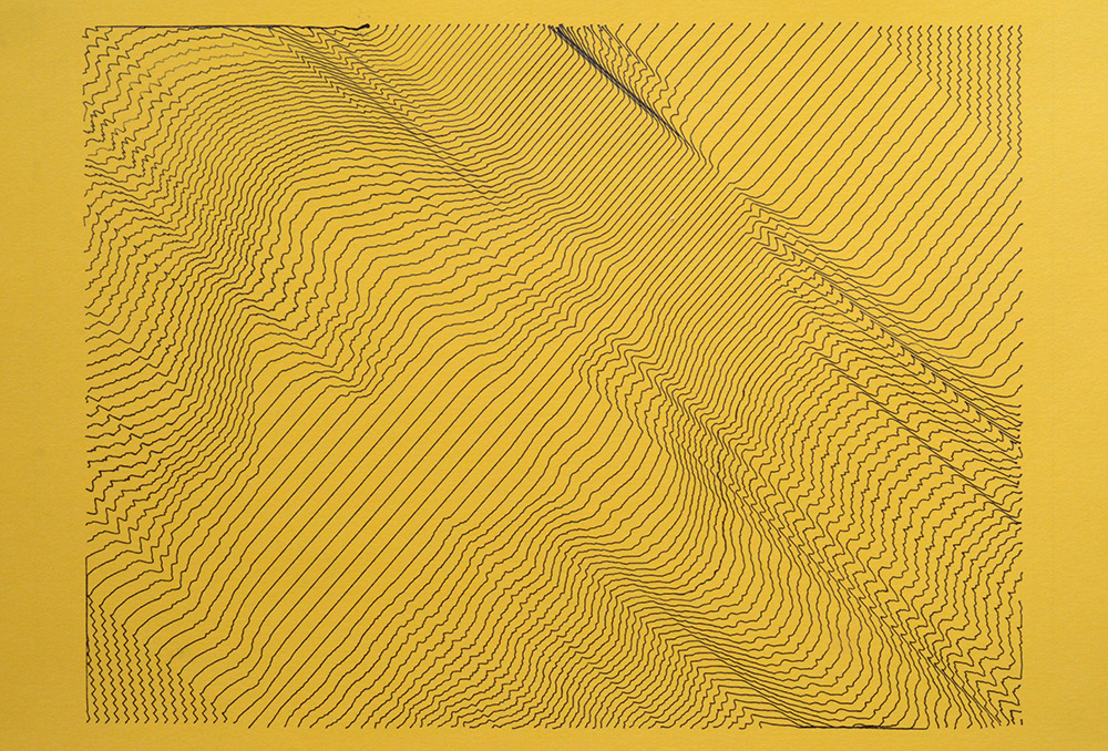
I might make a Waves 2 at some point to try and look more like the source image.
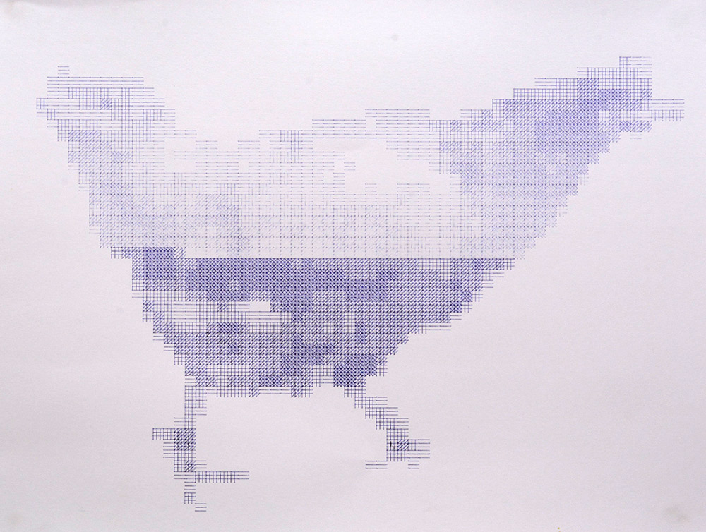
"Mosaic" pixellates the image into hatched sections. In the delightful chicken plot below, the collet was not properly tightened and the pen came loose midway. Luckily, it's easy to pause the plot and tighten it again, and we get a free additional layer of art.
On the subject of collets loosening, early experiments with StippleGen's output sometimes caused the collet to loosen because every circle was drawn in the same direction. This is really inkscape's fault for its object-to-path behaviour, but recently I've changed plotterfun to generate circles as arcs internally, for performance reasons. It would not be difficult to alternate the direction each circle is drawn, although beyond those first experiments, collet loosening doesn't seem to be much of a problem.
Here's a triptych of stipples, squiggles and sublines.
The stipples above are spirals, but the spirals start with a full circle before spiraling inwards. With that particular cyan ballpoint pen, the effect is like a partially-filled circle, where the ballpoint seems to dry out towards the centre. Odd. Maybe we need another slider to set spiral density.
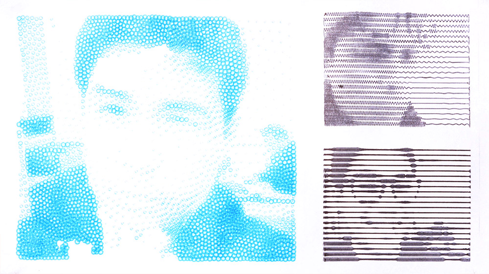
Other pens work better with spirals, and another stipple type available is simply dots. This can be had by mounting a felt tip marker in the plotter, and configuring all of the stipples to be as small as possible. That result comes probably closest to the original idea of a stipple.
Requiring no less than three pen-changes, one of the last things I attempted before the pandemic cut me off from the plotter was possibly the world's first CMYK Squiggle Plot.
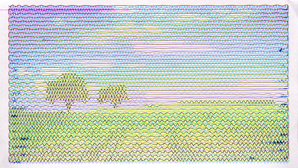
It is far less unsuccessful than I could have imagined. The vertical alignment is way off, this is because the peak amplitude of the top row of each plot was different, and I should have spotted that sooner. And the shade of yellow is not quite right, you wouldn't believe how tricky it is to get hold of a bright yellow ballpoint pen. But despite this, from a distance, the colours really do blend together, the grass is green and the sky is blue.
I've no doubt that full colour plotting is the way of the future.