
Corporate Identity: Livetech
5 Jul 2007Progress: Completed
What follows is a loose summary of my GCSE DT coursework. Yes, it’s old and amateurish. Yes, it’s contrived to fill the boxes and isn’t worth anything to the real world. Yes, it’s all in Welsh. But it’s still a pretty awesome result.
One of the things I learnt back then was to know your competition. I used to go berserk at these things from the outset, leaps and bounds ahead of everyone only to sit around, bored out of my mind until the deadline, as I’d finished far too early. The real problem with that is that your work is there for all to see, and you can guarantee most people will at least slightly copy it. You’re inspiration to the class, but you get no credit for it.
This almost-two-year project, I took a different approach. I spent the entire time sitting around and thinking. To onlookers I’d made literally no progress. For the first time in my life (but certainly not the last), I blitzed the whole thing in a weekend. I stumbled into school having not slept in two nights, with a project superior to all.
In brief
The idea was:
Make a corporate design
Make a model of the shop
Make letterheads, business cards, boxes, pencils, etc
Make a website
I don’t have any of the written pages of the project, they were all handed in. I also can’t be bothered to translate much of it, so I’ll leave out all the boring bits and jump straight ahead to the results.
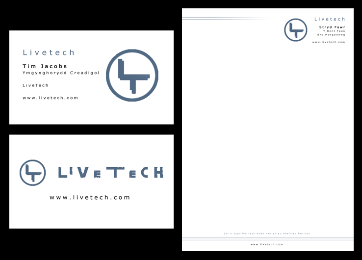

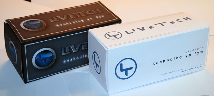
The website was pretty terrible.
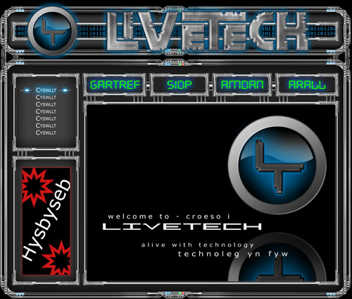
The model, though, is where it starts to get interesting. I wish I’d taken more pictures at the time.
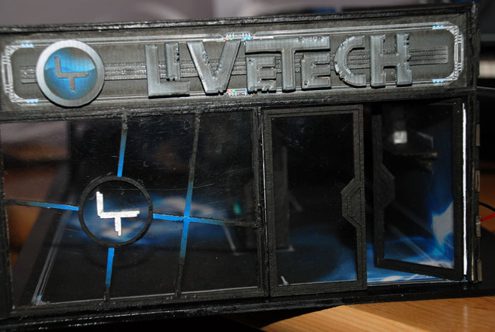
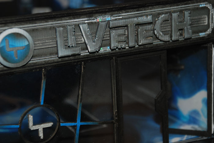
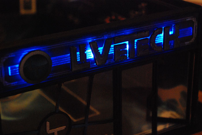
I made an LED backlit shop front. What with the laser cutter the school was so proud of, I just had to go over the top.

I etched a million little ones and zeros into the clear acrylic, so that when the LEDs were attached, it’d all glow nicely.
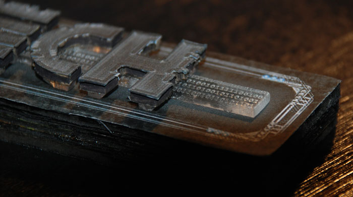
And glow nicely it did indeed.

Gasp in mock excitement as my laser cut cardboard doors are transformed into modern luxury with just a spray of paint and some bits of acetate!
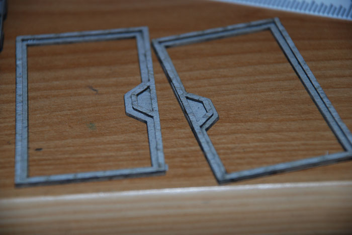
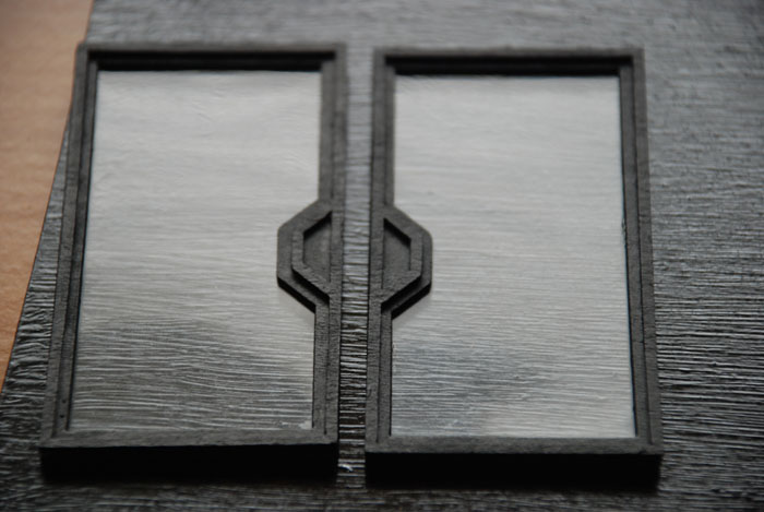
The shop front.
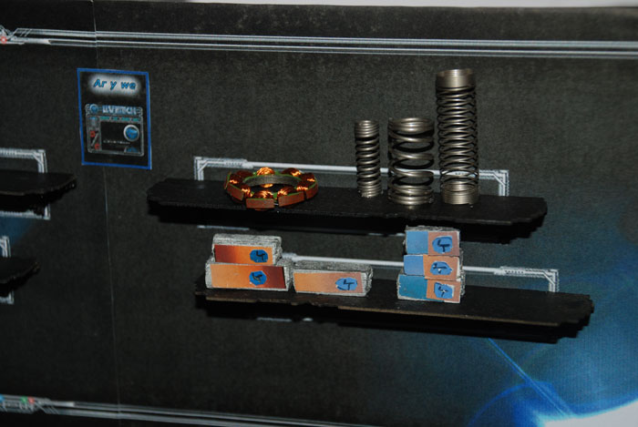
I filled the inside of the shop with electronic parts. I was quite proud of how it looked actually – it took only five minutes to fill the shelves.
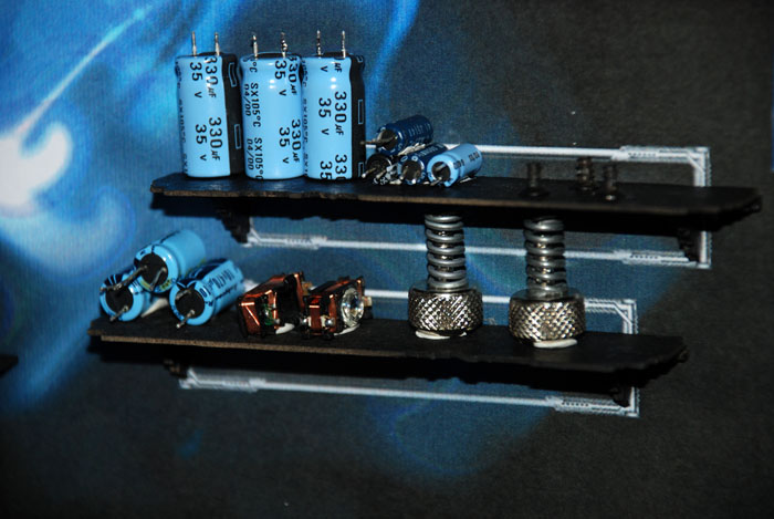
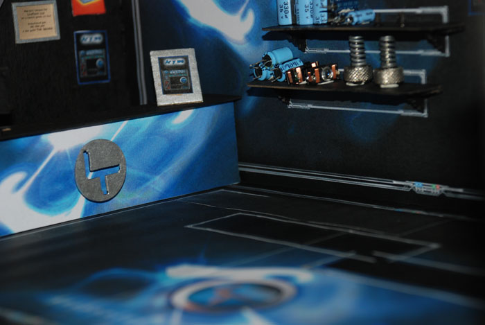
I put swirly goo patterns on the walls and the floor. I made them by continuously distorting a lens flare in Photoshop.
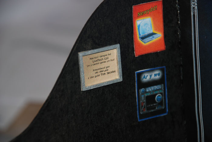
And of course I fitted tiny posters, and a framed certificate to say my model is the best in the world.
The highlight of the model though is the desktop PC. It’s very hard on camera to get a feel for just how small and detailed I made it. Hence my fingers intruding on the workspace.
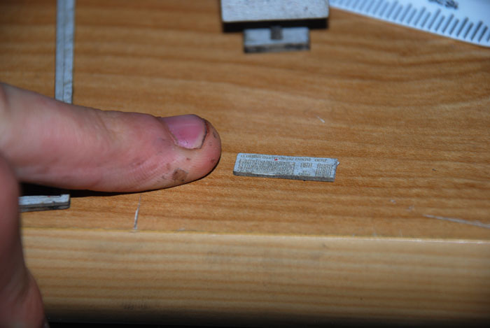
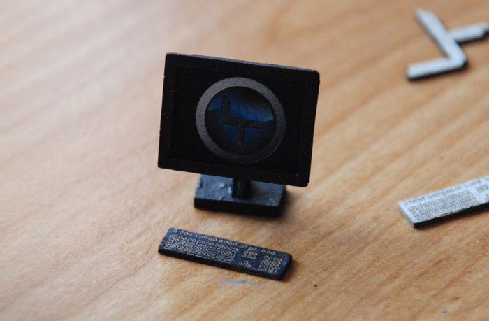
It’s pretty hard to see in the picture, but the screen image is actually recessed in the frame of the monitor.
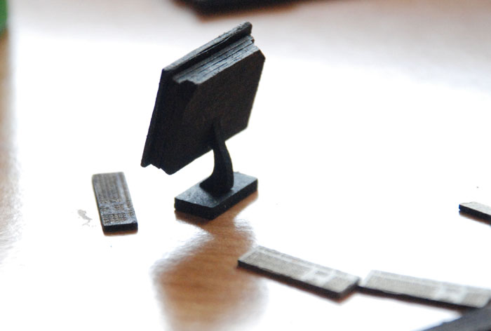
The back was built up from layers of thin card. I made a tiny slot for the stand to connect to snugly, it virtually held together without glue.
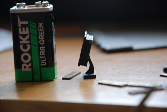
Another size comparison shot, the old 9V battery.
There was a lot more to this project, but virtually all of it was hand drawn, so I’m left with almost no record of it. Maybe one day I’ll see if I can get hold of the old file, and scan it all in, but until then, these photos are all I’ve got left of the thing.